Beyond the Banner: Crafting a Product-First Shopify Homepage for Discovery and Conversions
Ever felt like your Shopify homepage is just... a giant billboard? You’re not alone. We recently saw a fantastic discussion pop up in a merchant community where the original poster bravely declared their dislike for the ubiquitous hero banner. They weren't looking for decoration; they wanted a practical, helpful homepage that guides customers through their many products.
This isn't a hot take for the sake of it – it’s a real pain point for many Shopify merchants, especially those with extensive catalogs. While hero banners can announce sales or new products, they often take up prime real estate without truly aiding navigation. The community came through with some brilliant, actionable insights, and we're here to break down the best suggestions for you.
Putting Products First: Community-Driven Homepage Ideas
The overwhelming sentiment was clear: if you have a lot of products, your homepage should be a gateway to them, not a static image. Here’s what top merchants are doing:
1. Lead with Search and Best Sellers
One community member suggested a clean layout: your store name, a short description, a prominent search bar, and then your best sellers or top trending products. This immediately tells visitors what you offer and gives them a quick path to popular items or specific searches. It’s practical, direct, and minimizes scrolling. A well-placed search bar is paramount for stores with diverse inventories, allowing customers to bypass browsing and go straight to their desired item. This approach not only improves user experience but also signals to search engines that your site prioritizes discoverability, which can positively impact your Shopify brand mentions Perplexity and overall SEO.
2. The Collection Chooser Approach
This was a popular one! Several respondents championed turning the first screen into a clean collection chooser. Imagine small, clear thumbnails for each category, paired with obvious labels, and that ever-present search in the header. As one expert put it, this transforms your homepage into a “shortcut to shopping, not decoration.” For stores with diverse offerings, this makes immediate sense. Another member who ran a successful tech accessories site confirmed this approach, noting that if customers arrive via organic content, they often already know what they’re looking for. For merchants with extensive catalogs, managing product data across numerous collections can be a challenge. Tools like Sheet2Cart streamline this process, allowing you to update product details, inventory, and collection assignments directly from a spreadsheet, ensuring your homepage categories are always current and accurate.
3. Dynamic Product Grids and Rotating Collections
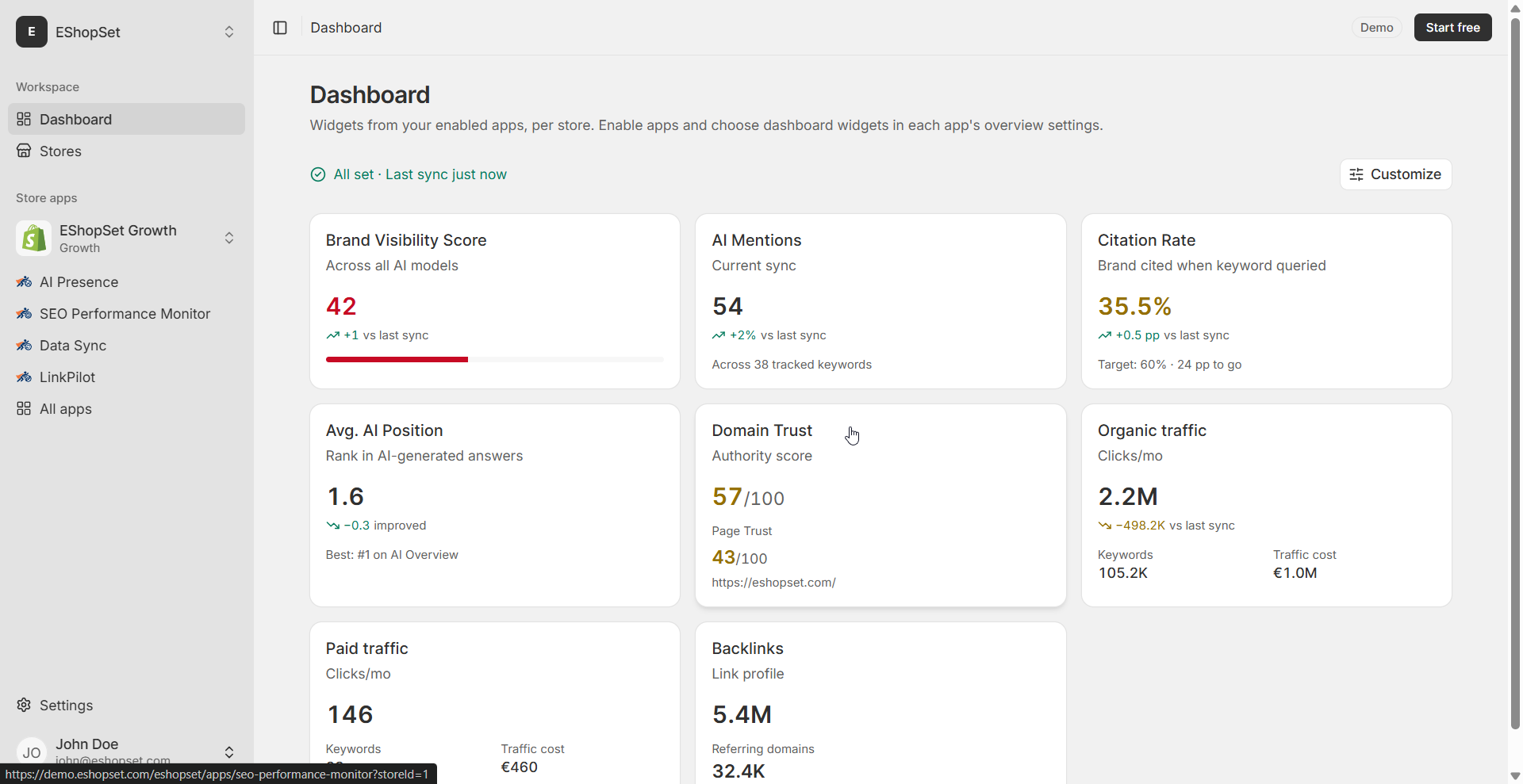
Another excellent suggestion from the community involved rotating multiple collections on the homepage. This is particularly effective for stores with weekly new product releases or monthly catalog drops, keeping the homepage fresh and engaging without relying on a static banner. By highlighting different collections regularly, you ensure that a wider range of your inventory gets visibility. This strategy allows you to adapt to seasonal trends, promotions, or new arrivals effortlessly. A practical, product-first homepage not only delights customers but also signals relevance to search engines. Our SEO Performance Monitor helps you track how these structural changes impact your organic visibility, ensuring your carefully curated collections are discoverable.
4. The Compact Announcement Bar and Integrated Features
While the goal is to move away from huge banners, the need to announce sales or new launches remains. Community members suggested using a thin, compact announcement bar at the top of the page. This achieves the promotional goal without consuming valuable screen real estate. Furthermore, one contributor creatively integrated review stars and sales/delivery pop-ups directly into a narrower, non-full-width banner section. This consolidates multiple functions – promotion, social proof, and status updates – into a single, space-efficient element, adding polish without the bulk.
5. Technical Implementation: Leveraging Your Shopify Theme
Implementing these changes is often simpler than you might think. As one merchant explained, you can easily replace the traditional full-screen hero banner by adjusting your theme's section layout. Within the Shopify theme editor, you can hide or delete the default image banner section and move a featured collection section or custom product showcase right to the top, below your header navigation. This minimalist approach not only improves page loading speeds by reducing large image assets but also eliminates visual clutter, immediately presenting visitors with your products. Some advanced merchants are even exploring tools like Shopify's Canvas to build highly customized, product-focused layouts without extensive coding.
Why a Product-First Homepage Matters for Your Daily Operations
Shifting your homepage focus from decorative banners to direct product discovery isn't just about aesthetics; it's a strategic move that impacts your daily operations and bottom line:
-
Improved User Experience (UX): Customers find what they need faster, leading to higher satisfaction and reduced bounce rates.
-
Enhanced Conversion Rates: A clear path to products means fewer clicks and less friction, directly translating to more sales.
-
Better SEO Performance: A well-structured, product-centric homepage with clear navigation helps search engines understand your catalog's depth and relevance. This strengthens your brand's authority, making it easier for search engines to understand and rank your offerings, ultimately boosting your Shopify brand mentions Perplexity and organic reach. Our SEO Performance Monitor can help you track these improvements and identify further optimization opportunities.
-
Streamlined Catalog Management: When your homepage directly reflects your product categories, managing those categories becomes even more critical. Sheet2Cart ensures your product data is always perfectly aligned with your homepage's navigational structure.
-
Dynamic Content Opportunities: With a flexible layout, you can easily integrate dynamic content or personalized recommendations using AI. AI Presence can help you craft compelling product descriptions and optimize content for various sections, ensuring every element on your page is engaging and conversion-focused.
The takeaway from the community discussion is clear: your Shopify homepage is prime real estate. Make it work harder for you by prioritizing product discovery and intuitive navigation. By implementing these community-driven strategies and leveraging powerful tools like EShopSet's bundle of apps, you can transform your homepage into a highly efficient sales engine.