Is Your Mobile Store Showing Its Desktop Side? Fix Responsive Design Glitches
Ever logged onto your online store on your phone, expecting that sleek, mobile-optimized experience, only to be greeted by a squished, miniature version of your desktop site? You know, the one with tiny text, overlapping images, and columns that refuse to stack? It’s a frustrating experience for you, and trust me, it’s a conversion killer for your customers.
This exact scenario recently sparked a lively discussion in an online community, highlighting a common, yet vexing, responsive design challenge. An original poster described encountering this bug on a website built with Wix Studio, specifically on phones like the Galaxy Z-fold 5, Samsung A15, and certain Huawei models.
The Heart of the Problem: Desktop Layout on Mobile
The original poster detailed how their site, despite having a mobile-specific layout configured, would stubbornly render the desktop version on these particular devices. Instead of columns wrapping neatly, content was crammed side-by-side, making the site virtually unusable. They even managed to replicate the issue in developer tools by shrinking the browser width below 320px, which suddenly triggered the desktop view. What made it puzzling was that the affected phones, while varied, all had CSS viewports well above this 320px threshold.
The original poster astutely suspected a device recognition issue, where the platform might be incorrectly identifying these mobile devices as desktop screens. This isn't an isolated incident; as they noted, similar threads and frustrations abound across various platforms. One community member immediately empathized with the difficulty, stating, “Ooof getting things to work good enough for desktop 1080 to 4k widescreen & mobile is already hard enough.” This sentiment perfectly captures the complexity of ensuring a consistent user experience across the myriad of devices available today.
Beyond Wix: A Universal Ecommerce Challenge
While the original discussion centered on Wix Studio, the core problem of a desktop layout appearing on mobile is not platform-specific. Store owners on Shopify, WooCommerce, Magento, Wix, BigCommerce, PrestaShop, and similar storefronts can all face similar responsive design issues. The underlying causes often stem from how websites interpret screen sizes and device capabilities.
Why Your Mobile Site Might Be Misbehaving (and How to Tame It)
- Missing or Misconfigured Viewport Meta Tag: The
tag is crucial. Without it, or if it's incorrectly configured, browsers might default to rendering your site at a desktop width and then just scaling it down, leading to the dreaded squished look. - CSS Media Query Mishaps: Media queries are the backbone of responsive design, allowing your site to apply different styles based on screen size. Errors in breakpoints, or an over-reliance on
max-widthwithout sufficientmin-widthconsiderations, can cause layouts to break on specific devices, especially newer ones with unique aspect ratios or foldable screens. - Rigid Layouts and Non-Flexible Assets: If your site uses fixed pixel widths for containers, images, or other elements instead of fluid percentages or
max-width: 100%for images, it will struggle to adapt to smaller screens. - Device Detection Logic: Some platforms or custom scripts attempt to detect device types (mobile, tablet, desktop) based on user agent strings or screen dimensions. This logic can sometimes be outdated or fail to recognize newer devices, leading to incorrect rendering.
- Caching Issues: Occasionally, server-side or browser caching might serve an older, non-responsive version of your CSS or JavaScript, even after you've implemented fixes.
The Business Impact: More Than Just Aesthetics
A poorly rendered mobile site isn't just an inconvenience; it's a direct threat to your ecommerce business:
- High Bounce Rates: Users encountering a broken site will quickly leave, increasing your bounce rate and signaling to search engines that your site isn't user-friendly.
- Lost Conversions: If customers can't easily navigate, read product descriptions, or complete checkout on their phone, they won't buy. All your marketing efforts, including those from apps that help Wix automate social posts, become ineffective if the landing experience is flawed.
- Damaged Brand Reputation: A professional online store demands a professional presentation on every device. A broken mobile experience erodes trust and makes your brand seem unprofessional.
- SEO Penalties: Google's mobile-first indexing means your mobile site's performance and usability directly impact your search rankings.
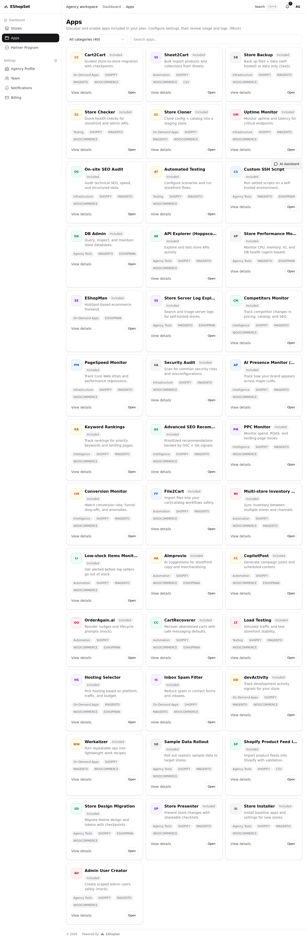
EShopSet: Your Partner in Flawless Mobile Commerce
At EShopSet, we understand that managing a thriving online store means ensuring a seamless experience across all touchpoints. While we don't build your storefront, our apps-first commerce operations bundle empowers you to monitor, manage, and optimize every aspect of your store's performance, including its responsive behavior.
Imagine having an app that constantly monitors your site's uptime and pagespeed across different devices and locations. EShopSet's suite of apps provides these critical insights, helping you identify and address performance bottlenecks or rendering issues before they impact your sales. Our marketplace offers tools for comprehensive SEO monitoring, ensuring your mobile site is not only functional but also discoverable.
With EShopSet, you can:
- Track Usage and Logs: Pinpoint exactly when and where issues like desktop layouts on mobile might be occurring, giving you the data needed for proactive fixes.
- Monitor Performance: Utilize apps to keep an eye on your site's loading speed and responsiveness across various devices.
- Enhance SEO: Ensure your mobile site adheres to best practices for search engine visibility, complementing your flawless user experience.
- Integrate Testing Tools: Discover apps that can help you conduct automated testing to catch responsive design glitches early.
Explore our full range of powerful ecommerce apps designed to give store owners and agencies the control they need over their commerce operations.
Actionable Steps for Every Store Owner
Don't let responsive design issues cost you sales. Here’s what you can do:
- Regular, Diverse Device Testing: Don't just rely on browser developer tools. Test your site on actual physical devices, including a range of smartphones and tablets, and even less common ones like foldables, to catch edge cases.
- Leverage Your Platform's Responsive Features: Most modern ecommerce platforms offer robust responsive design capabilities. Ensure you are utilizing them correctly and testing their output rigorously.
- Prioritize Mobile-First Design: When designing or redesigning, always think mobile-first. Start with the smallest screen and progressively enhance for larger ones.
- Implement Robust Analytics and Monitoring: Keep an eye on your mobile traffic, bounce rates, and conversion rates. Significant drops can signal underlying display problems.
- Consider EShopSet for Holistic Monitoring: Integrate EShopSet's suite of apps to gain a comprehensive, real-time overview of your store's health, performance, and user experience across all devices.
Conclusion
In today's mobile-driven world, a flawless mobile experience is not just a luxury; it's a necessity for ecommerce success. The frustration highlighted in the community thread serves as a powerful reminder that even with sophisticated builders, vigilance is key. By understanding the common pitfalls of responsive design and leveraging powerful monitoring and management tools like those offered by EShopSet, you can ensure your online store always looks its best, no matter how your customers choose to shop.