Shopify UI Confusion: Mastering Operations & Customer Trust with EShopSet
Ever found yourself staring at a new button or toggle in your Shopify admin, wondering if you're about to hit 'yes' or 'no'? You're definitely not alone. The evolving landscape of e-commerce platforms means frequent updates, and while these often bring powerful new features, they can sometimes introduce small moments of confusion into your daily workflow. We recently observed a compelling discussion within a merchant community that perfectly captures this feeling, specifically around the 'notify customer' toggle during order fulfillment. It’s a small detail, but getting it wrong can lead to customer confusion and extra work.
The Toggle Conundrum: A Common Operational Hurdle
The original poster in the community thread shared their struggle: "When fulfilling orders, there's now a toggle on/off button for notify customer. I couldn't figure out which one means notify and which one means no notification." They described two distinct states: one with a white background and grey toggle (on the left), and another with a black background and white toggle (on the right), asking for clarity.
This seemingly minor UI ambiguity highlights a significant operational challenge. For merchants handling dozens or even hundreds of orders daily, every second counts. Pausing to decipher a toggle's meaning introduces friction, increases the risk of error, and can detract from the seamless experience you strive to provide your customers.
Community Insights & The Verification Imperative
The sentiment of confusion was immediately echoed by another community member, who candidly called the design "a mess" and admitted to spending five minutes trying to figure it out themselves. Their initial, logical guess was that the "dark background with the white circle means it's active," implying it would send the notification.
However, the original poster's follow-up complicated things. After testing this 'logical' assumption, their customer reported not receiving the notification. This highlights a critical point: sometimes what seems intuitive isn't always how the system behaves, and real-world testing is invaluable. It underscores the importance of not just understanding the UI, but also verifying its actual function.
Another respondent hit the nail on the head: "Honestly, if you have to stop and guess whether a toggle is on or off, the design isn’t clear enough." They stressed the importance of clear design for critical functions like customer notifications, where errors can directly impact customer experience and even lead to a loss of trust. Imagine a customer expecting a shipping notification but receiving none, or worse, receiving an unexpected one. These small missteps can erode confidence in your brand.
Fortunately, a seasoned community member jumped in with excellent advice on how to verify if any UI action or setting change has actually taken effect. They recommended checking for the dark confirmation toast notification at the bottom left of your screen, or watching for the main Save button in the upper right header to switch from active blue to a greyed-out saved state. For theme or product updates, opening your storefront in an incognito window or checking your admin activity log provides instant verification. They also suggested clearing your browser cache or disabling browser extensions to prevent interface lag.
Beyond the Button: Broader Operational Clarity with EShopSet
While a single toggle might seem like a minor issue, it's indicative of a larger principle: operational clarity is paramount for any successful Shopify store. Merchants need tools that simplify, not complicate, their daily tasks. At EShopSet, we understand that every interaction, every piece of data, and every customer touchpoint contributes to your brand's success. Our bundle of Shopify apps is designed to bring this clarity and efficiency to your most critical operations.
SEO Performance Monitor: Illuminating Your Store's Visibility
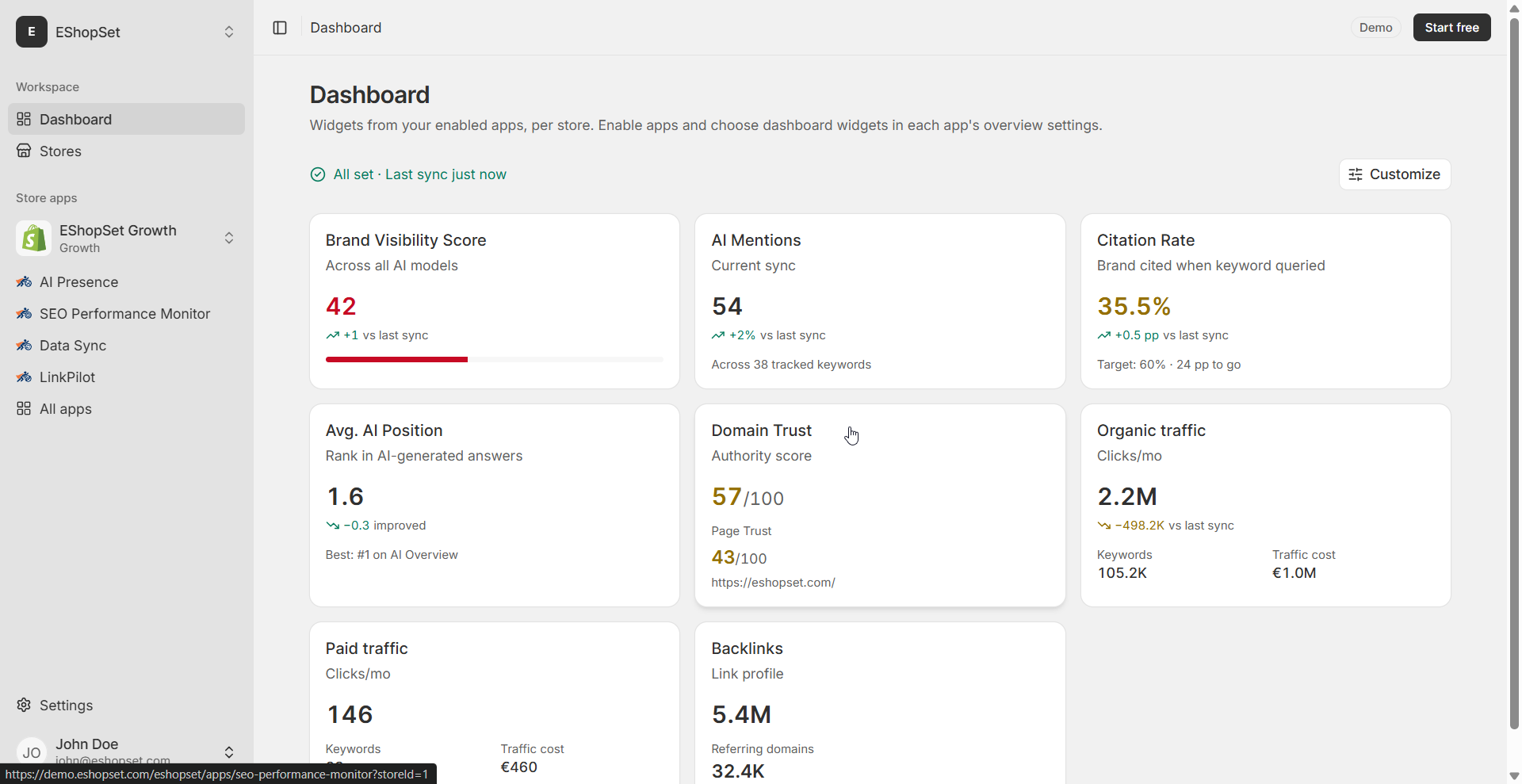
Just as clear UI prevents confusion for merchants, clear data helps you understand your store's performance. Our SEO Performance Monitor provides actionable insights into your search engine visibility. With a robust Shopify keyword rank tracker, you can easily see where your products stand in search results, helping you optimize for organic discovery. Understanding your search performance is crucial for strategizing how to balance Shopify paid vs organic traffic efforts, ensuring that all your marketing channels are working in harmony to drive growth.
AI Presence: Ensuring Consistent Customer Engagement
If a simple toggle can cause confusion, imagine the impact of inconsistent customer communication. Our AI Presence app helps you maintain a consistent, on-brand voice across all automated customer interactions. By leveraging AI to craft compelling product descriptions, marketing copy, and customer service responses, you ensure that every message is clear, helpful, and aligned with your brand identity. This clarity in communication builds trust and reduces the need for customers to second-guess your messages, much like a well-designed UI should eliminate merchant uncertainty.
Data Sync: The Foundation of Reliable Operations
At the core of seamless operations is accurate and synchronized data. Our Data Sync app ensures that your product catalog, inventory, and customer information are always consistent across your Shopify store. This reliability is critical for preventing discrepancies that could lead to fulfillment errors, inventory miscounts, or incorrect customer notifications. Just as you need a clear UI to execute actions correctly, you need robust data synchronization to ensure those actions are based on accurate information, fostering operational resilience.
Best Practices for Merchants in an Evolving UI Landscape
To navigate the ever-evolving Shopify UI and maintain peak operational efficiency, consider these best practices:
- Always Test New Features: Before rolling out any new process or relying on a newly discovered UI element, perform a quick test. For critical functions like customer notifications, send a test order to yourself or a trusted colleague.
- Document Internal Processes: Create clear, concise internal guides for your team, especially for common tasks. Include screenshots of the correct toggle states or button actions.
- Leverage EShopSet for Clarity and Automation: Utilize tools that simplify complex tasks. EShopSet's apps are designed to reduce manual effort and provide clear insights, freeing you to focus on growth rather than UI deciphering.
- Stay Informed: Keep an eye on Shopify's official announcements and community forums for updates on UI changes and best practices.
Conclusion
Operational clarity is not just about avoiding frustration; it's about building a robust, trustworthy e-commerce business. While a confusing toggle might seem minor, it underscores the broader need for intuitive systems and reliable processes. By embracing best practices and leveraging powerful tools like EShopSet's SEO Performance Monitor, AI Presence, and Data Sync, Shopify merchants can transform potential UI hurdles into opportunities for enhanced efficiency, stronger customer relationships, and sustained growth. Visit eshopset.com/apps/ to explore how our bundle can streamline your daily operations.