Mobile Mayhem: Why Your Store's Fonts Disappear on Mobile & How to Fix It
Ever poured hours into perfecting your storefront's design, only to find it looks completely different on a mobile device? You're not alone. It's one of the most common, and frankly, most frustrating, hurdles for store owners, whether you're on Shopify, WooCommerce, Magento, Wix, BigCommerce, PrestaShop, or any other platform.
Recently, a community member shared their specific pain point on a forum: their Wix Hotels site displayed the correct font in the mobile editor, but on a live mobile device, it reverted to a default, incorrect font and color. This isn't just a Wix issue; it's a universal challenge that speaks volumes about the complexities of delivering a consistent user experience across countless devices and browsers.
The Mobile Font Mystery: Why Does This Happen?
When your mobile editor shows one thing, but the live site shows another, it's like a magic trick gone wrong. Here are some of the usual suspects behind these frustrating font discrepancies:
- Caching Calamities: Browser caches, CDN caches, and even your platform's internal caching mechanisms can sometimes serve an outdated version of your site's CSS or font files. This means your device might be seeing an old snapshot, not your latest changes.
- Mobile-Specific Overrides & Responsive Design: Many platforms offer separate settings or CSS rules specifically for mobile views, often implemented via
@mediaqueries. What looks perfect in the desktop editor might be overwritten or ignored by mobile-specific styles, which are sometimes overly aggressive or misconfigured to optimize for smaller screens. - Font Loading Fiascos: Custom fonts need to be loaded efficiently and correctly. If there's a delay, an error in the font file path, or if the font isn't hosted correctly (e.g., missing web-friendly WOFF, WOFF2 formats, or incorrect
@font-facerules), the browser might default to a system font to avoid blank text areas (known as FOUT - Flash of Unstyled Text, or FOIT - Flash of Invisible Text). Cross-Origin Resource Sharing (CORS) policies can also block font loading if files are hosted on different domains without proper headers. - Conflicting CSS or App Interference: Third-party apps, plugins, or extensions (like review widgets, pop-ups, or chat tools) often inject their own CSS. This can inadvertently override your theme's font styles, leading to unexpected changes. Similarly, recent theme updates or custom code snippets can introduce conflicts.
- Browser Compatibility & Device Differences: Not all browsers render fonts identically, and older devices or browser versions might lack support for certain CSS properties or modern font formats. This can lead to inconsistencies across your audience's diverse devices.
- Incorrect Character Sets: While less common, if your website uses specific characters that your chosen font doesn't support, the browser may fall back to a default font for those characters or even the entire text block.
Diagnosing the Discrepancy: Your Troubleshooting Toolkit
Facing a mobile font mystery can be daunting, but a systematic approach can help you pinpoint the problem. Here’s how to troubleshoot:
- Clear All Caches: Start by clearing your browser cache, any CDN cache you might be using, and your e-commerce platform's internal cache. This ensures you're seeing the absolute latest version of your site.
- Inspect Element (Mobile Debugging): Leverage your browser's developer tools (e.g., Chrome DevTools, Firefox Developer Tools). Use their device emulation mode to simulate various mobile devices. For a more accurate diagnosis, use remote debugging tools (like Safari Web Inspector for iOS or Chrome remote debugging for Android) to inspect your live site on an actual mobile device. Look at the
styles for your text, check theComputed
tab for font file loading errors, and review theNetwork
for any JavaScript or CSS errors.Console - Verify Font File Paths and Formats: Examine your theme's CSS files for
@font-facerules. Ensure thesrcpaths to your font files are correct and that the files themselves are accessible. Confirm that you're using web-friendly formats like WOFF and WOFF2, which offer broad browser support and better compression. - Audit Mobile-Specific CSS: Search your theme's CSS for
@mediaqueries that target mobile devices. These rules might be overriding your desired font styles. Adjust or remove conflicting rules as needed. - Disable Third-Party Apps (Temporarily): If you suspect an app or plugin is causing the issue, disable them one by one. After each deactivation, check your mobile site to see if the font issue resolves. This systematic approach helps isolate the culprit.
- Test on Multiple Devices and Browsers: Don't rely on just one phone or one browser. Test your site on various mobile devices (iOS, Android) and different mobile browsers (Safari, Chrome, Firefox) to identify if the problem is device- or browser-specific.
- Check Platform-Specific Settings: E-commerce platforms like Wix, Shopify, and WooCommerce often have dedicated mobile design settings or theme customizers. Double-check these areas for any overrides or specific font selections for mobile views.
Proactive Store Health: EShopSet's Role in Consistency and Performance
Beyond fixing immediate font issues, maintaining a consistent and high-performing online store requires ongoing vigilance. This is where EShopSet (eshopset.com) becomes an invaluable partner for store owners.
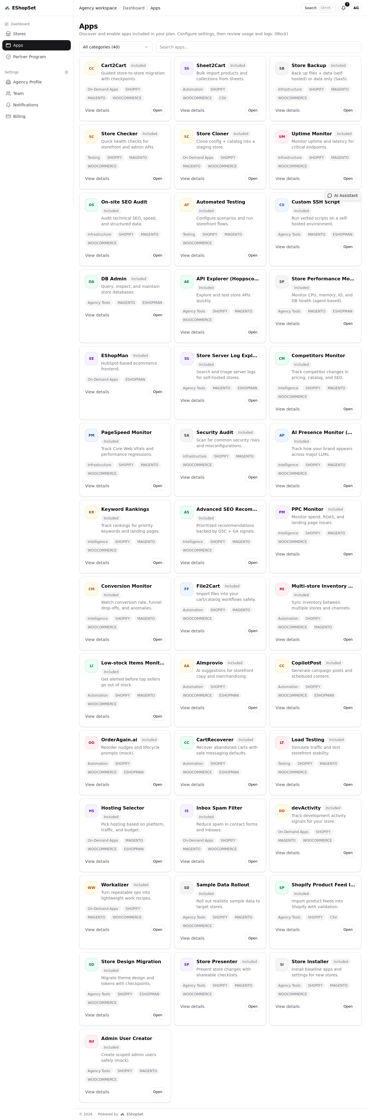
EShopSet is an apps-first commerce operations bundle designed to streamline your store management. From a unified marketplace, you can discover and enable essential apps per store, configure their settings, and track their usage and logs, all with clear billing by plan. For agencies, a control center allows for managing multiple stores efficiently.
While EShopSet might not have a direct 'font checker' app, its ecosystem of tools is crucial for overall store health and performance, which indirectly impacts visual consistency. For instance, performance monitoring apps can alert you to slow page load times that might prevent custom fonts from loading correctly. Tools that help you audit theme code or identify conflicting CSS can be invaluable in preventing issues before they impact your live site.
A robust WooCommerce store health check, for instance, goes beyond visual elements. It encompasses everything from uptime monitoring and page load speed to inventory accuracy and security. By integrating apps from the EShopSet marketplace, you can ensure all these critical aspects are continuously monitored and optimized. Similarly, for Shopify users, an effective Shopify app for low-stock items monitor isn't just about preventing oversells; it's about understanding how your store's overall performance, including its visual appeal, impacts sales velocity and thus, inventory levels.
By centralizing your critical operations through EShopSet's app marketplace, you gain a holistic view of your store's health. This ensures that design integrity, operational efficiency, and a seamless customer experience go hand-in-hand, preventing frustrating issues like disappearing fonts and keeping your store running smoothly across all devices.
Conclusion
Ensuring your e-commerce storefront looks and functions consistently across all devices, especially mobile, is not just about aesthetics—it's fundamental to user experience, brand perception, and ultimately, conversions. The 'mobile font mystery' is a common challenge, but with the right troubleshooting steps and proactive monitoring, it's entirely solvable.
By understanding the underlying causes and employing a systematic diagnostic approach, you can maintain the visual integrity of your store. And with comprehensive platforms like EShopSet, you can empower your operations with the tools needed for continuous monitoring and optimization, ensuring your store always puts its best font forward.